
In the realm of data analysis, following the data visualization best practices is essential to convey complex information effectively. Selecting the right visuals for your data analysis project in 2023 is an amazing skill that can significantly enhance the clarity and effectiveness while communicating your ideas. Whether you are creating dashboards, presentations, or reports for your clients, selecting the appropriate chart or graph is essential. In this post, we will explore the 5 best ways to select visuals for your data analysis projects while adhering to the data visualization best practices for 2023.
5 Steps for any data analysis project
- Data Collection: The first step in the process of creating effective visualizations is to collect the relevant data from a variety of sources, such as surveys, databases, or sensors. This step is the backbone of any data analysis project which ensures the quality of your final project. So, make sure that you are working with the correct datasets. If possible, perform some data integrity or sanity checks, such as identifying missing or inconsistent data, are critical. Other methods like cross-validation with trustworthy sources, data profiling, and the use of checksums can help you in verifying data accuracy.
- Data Preprocessing: After collecting the data, you must preprocess it. This step includes cleaning the data, handling missing values, and standardizing data formats to ensure it’s ready for analysis.
- Data Exploration: Data exploration involves visually inspecting the data using basic statistics and charts to gain insights and identify patterns and trends.
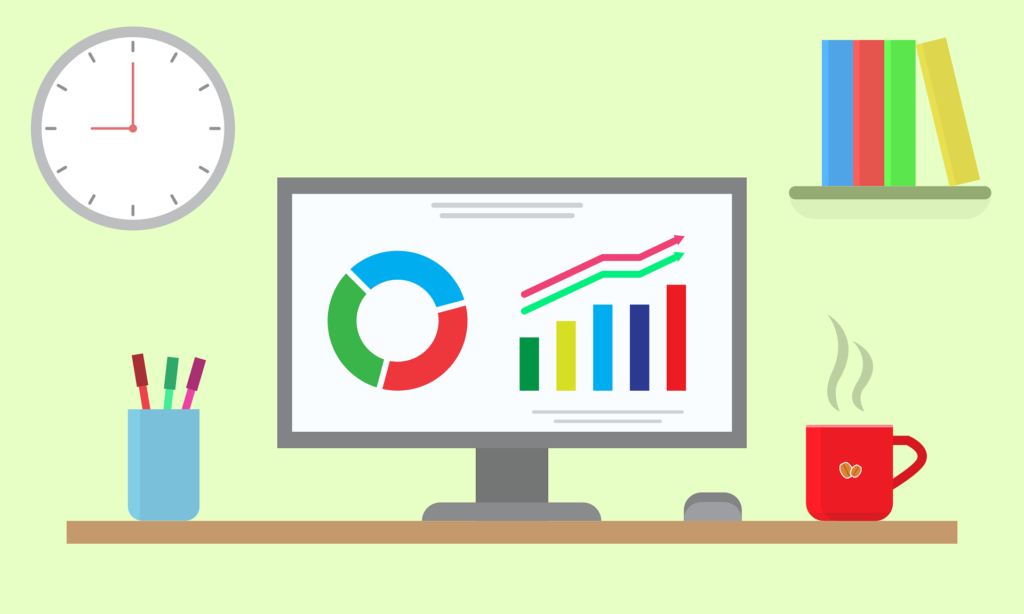
- Data Visualization: In this step, you will select the appropriate data visualization techniques to represent your findings effectively. This step is the focal point of our article, aligning with the data visualization best practices/
- Data Communication: The final step involves presenting your visualizations to your target audience or clients through reports, presentations and interactive dashboards while following the latest guidelines and data visualization best practices.
You can join our official telegram channel to get updated with data analysis domain: Data Analytics Jobs & Internships
Techniques for Visual Data Analysis
Visual data analysis involves various techniques that have evolved in recent years, such as:
- Scatter Plots: Ideal for visualizing the relationship between two numerical variables and understanding trends.
- Histograms: Effective for exploring the distribution of a single variable and identifying key data points.
- Box Plots: Useful for presenting the distribution, central tendency, and identification of outliers in your dataset.
- Heatmaps: Perfect for displaying data with two categorical variables, revealing patterns and correlations.
- Line Charts: Great for visualizing time-series data and highlighting trends over time.
The 5 Senses of Visualization
Data visualization appeals to our five senses to convey information effectively:
- Sight: The primary sense involved in data visualization, using visual elements like colors, shapes, and patterns to represent information.
- Hearing: Although less common, auditory elements may be used in interactive visualizations to enhance the user experience.
- Touch: In some interactive visualizations, haptic feedback can provide a tactile aspect for users.
- Taste and Smell: These senses are rarely incorporated in data visualization, but metaphorically, they can relate to the “flavor” or “smell” of trends and insights within the data.
The 4 Keys to Visualization based on data visualization best practices
Four fundamental principles guide successful data visualization, in line with the best practices for 2023:
- Accuracy: Ensuring that the visual representation accurately reflects the underlying data without distortion or misrepresentation, adhering to the latest standards.
- Simplicity: Keeping visualizations clean, clear, and free from unnecessary clutter or decoration while embracing contemporary design trends.
- Storytelling: Utilizing visualizations to tell a compelling narrative, highlighting key insights and trends in the data, while following the current storytelling guidelines.
- Consistency: Maintaining a consistent color scheme, layout, and labeling throughout your project, aligning with the latest design trends to enhance comprehension and usability.
Conclusion
Selecting the right visuals for your project is a skill that can significantly influence how well your findings are understood and utilized. By considering your audience, matching data types to visualizations, highlighting key insights, avoiding distortion, and maintaining simplicity and clarity, you can create compelling and effective data visualizations while adhering to the data visualization best practices Understanding the fundamental steps in data visualization, utilizing the latest techniques, acknowledging the role of the five senses, and adhering to the keys for successful visualization will further enhance your data visualization skills. Remember that the goal is not just to present data but to convey meaningful insights that drive informed decisions while staying up to date with the best practices of 2023.
If you are planning to grab a new job opportunity as a Remote Data Analyst then you can refer this post to find latest opportunities.
Share the post with your friends

1 thought on “Data visualization best practices: 5 ways on how to select visuals”